
Role: UX/UI Designer + Brand Designer
Project Type: End-to-end niche marketplace
Timeline: 8 weeks
Industry: Specialty Food & Beverage / Travel-Tech
Tools: Figma · Photoshop · FigJam
The Challenge
The Oportunity
Mainstream navigation and food discovery platforms prioritize data volume over quality curation. For the specialty coffee enthusiast, searching for a good cup of coffee has become a process of sifting through "fast-food chains, and generic breakfast joints which leads to wasted time and a degraded morning ritual.
Travelers and niche coffee enthusiasts crave a zero-friction discovery tool that guarantees quality. By filtering the market to only include specialty roasters, DRIP. connects the high-frequency daily ritual with artisanal businesses, reclaiming the user's time and morning experience.
Problem Statement
“How might we eliminate the search-fatigue of the specialty coffee drinker by creating a curated ecosystem that rewards their high-frequency habit with instant, guaranteed access to specialty coffee?”
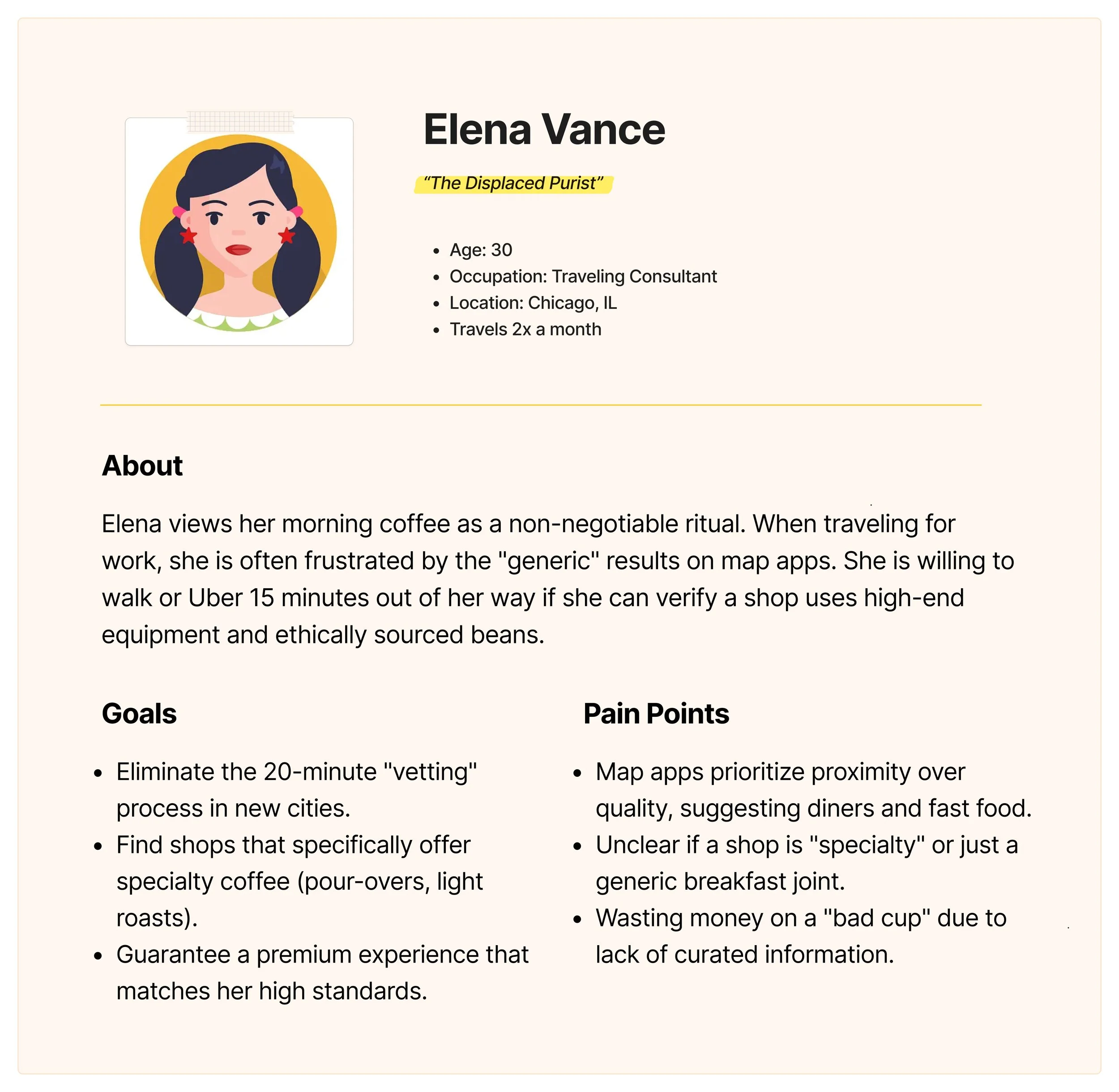
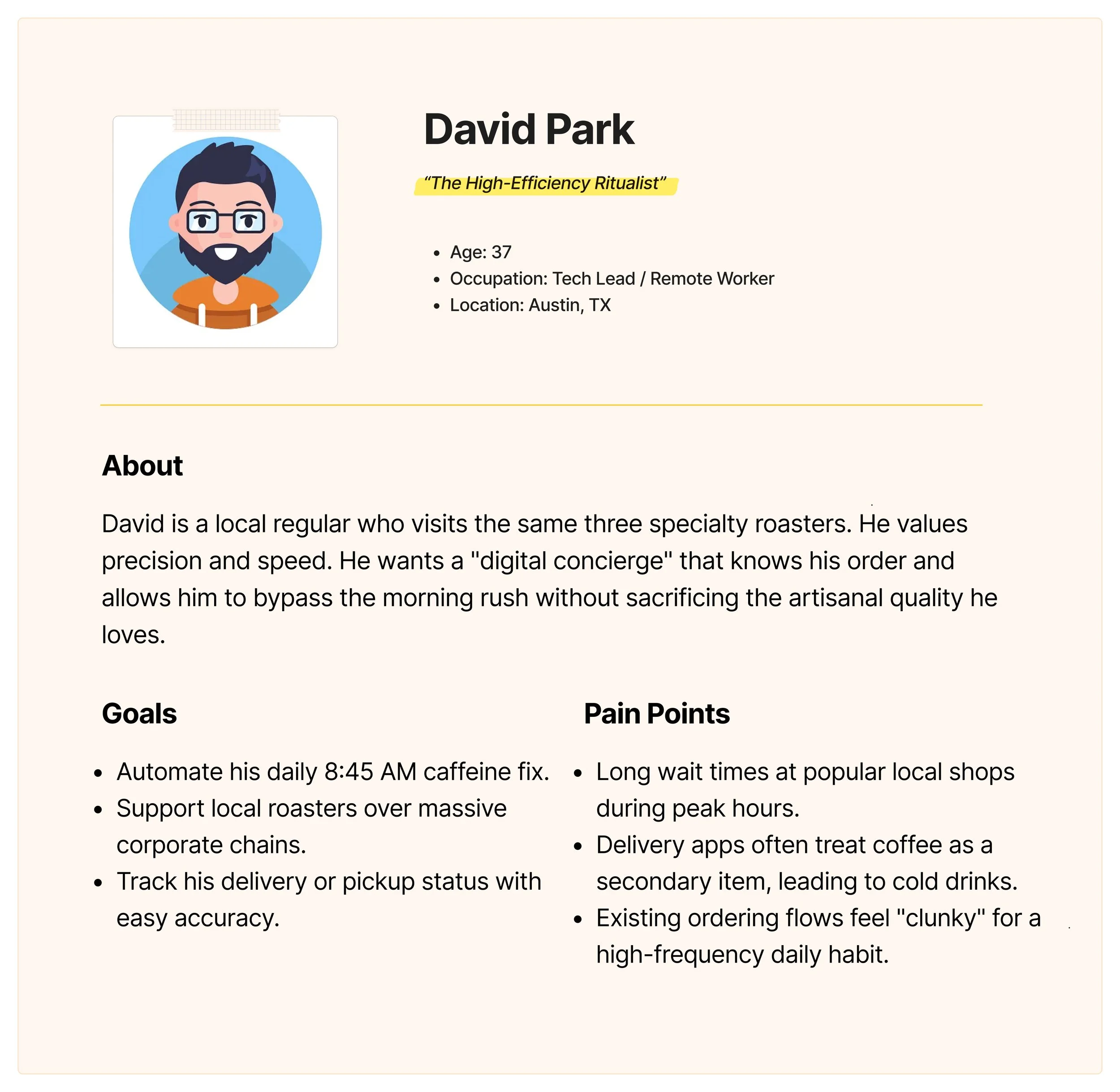
User Personas
Pain Points
90% of map results are trivial to specialty coffee drinkers.
Users waste 15–20 minutes vetting shops in new cities via reviews.
No trusted system exists to filter "specialty" from "commodity" coffee.
Users bounce between apps to find, order, and track their daily ritual.
Methodology
Methods:
15 user interviews
Competitive analysis of Starbucks, Dunkin, Google reviews, Yelp.
Findings:
86% of respondents stated they would rather walk 15 minutes further for a "Good cup” than get a lower quality cup across the street.
Research
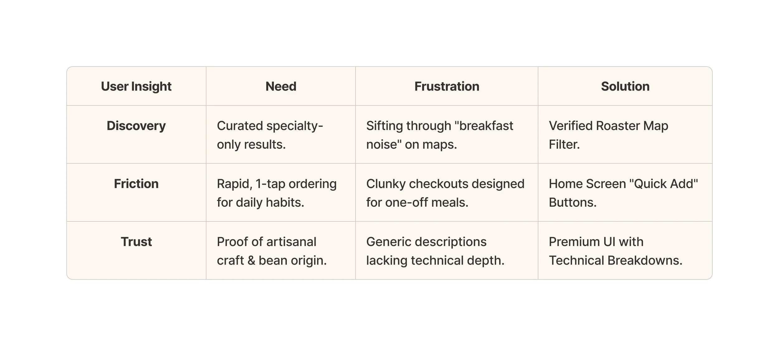
User Insight
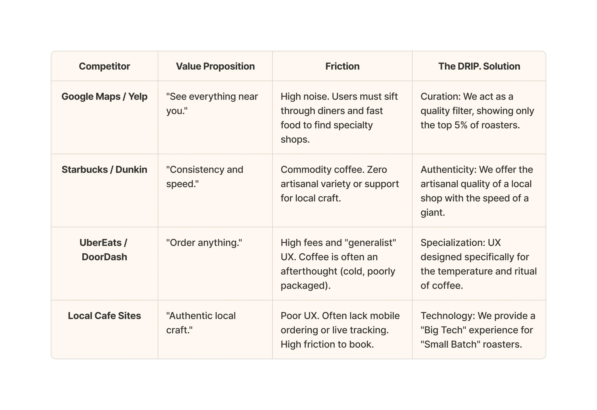
Competitive Landscape
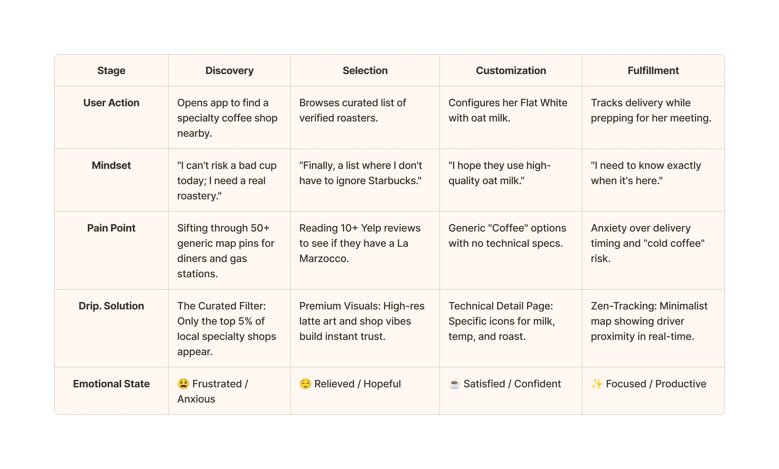
User Journey
Persona: Elena (The Displaced Purist)
Scenario: Arriving in a new city for a 9:00 AM meeting and needing to find a specialty coffee shop.
Design Analysis
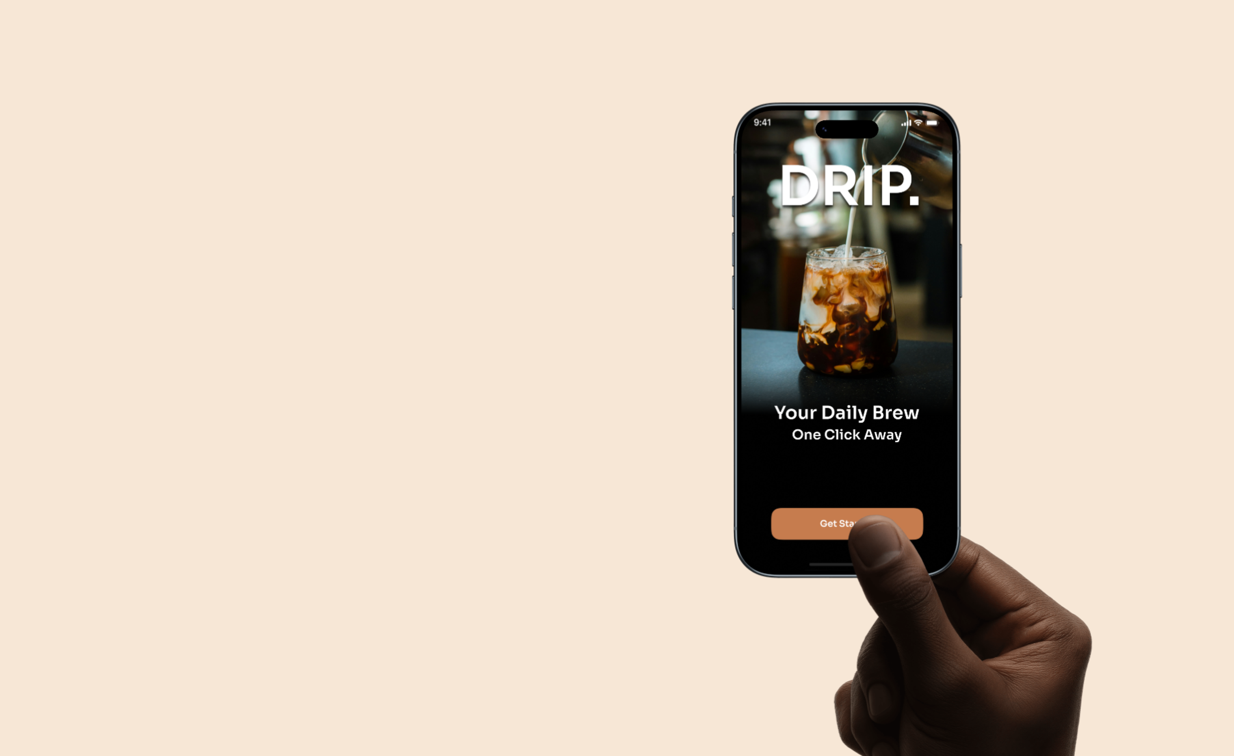
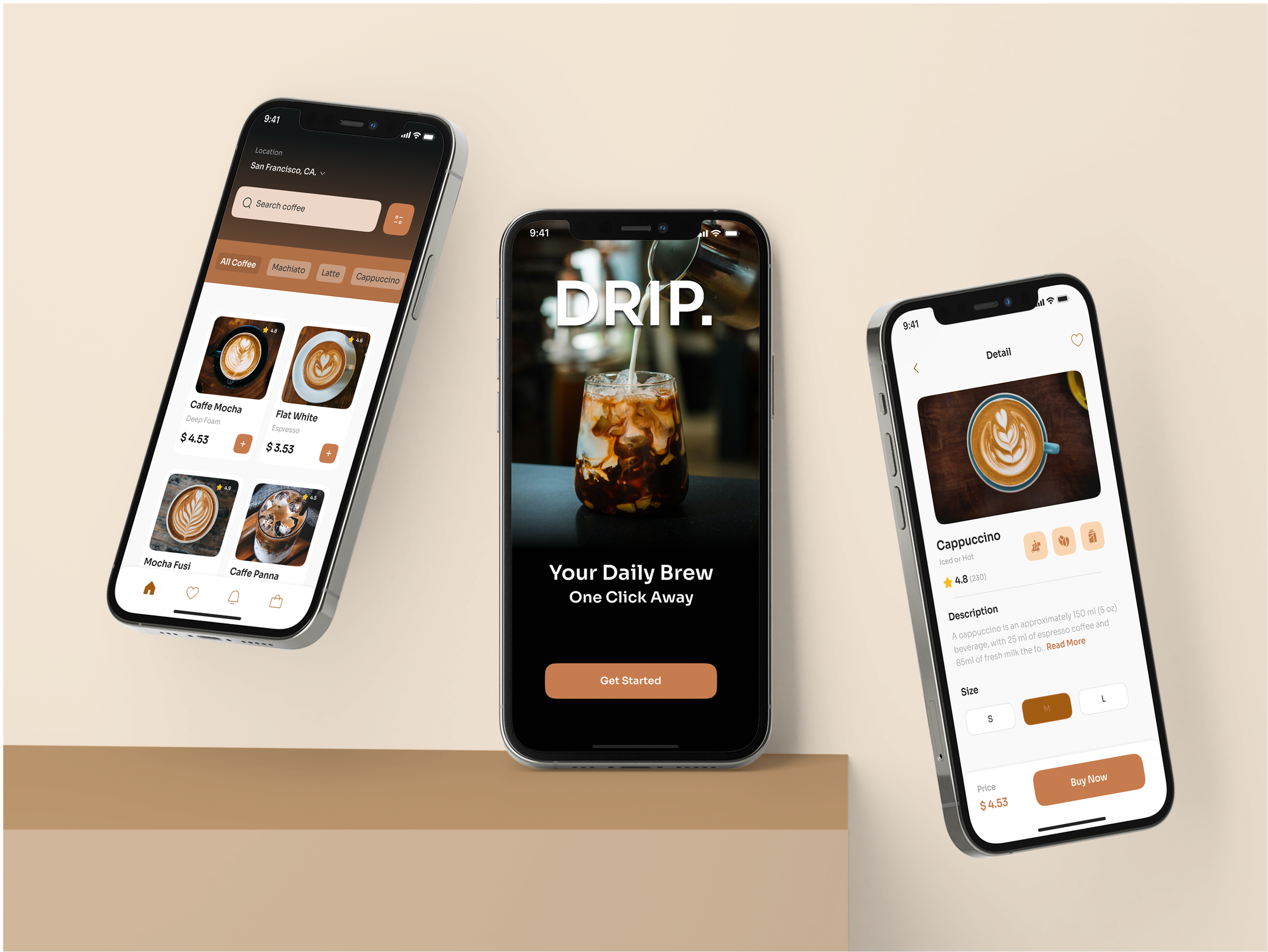
Screen 1: The "Pure" Entry
I chose a high-contrast, immersive hero image. The goal is emotional resonance.
Design Decision: The "Get Started" button is high-contrast terracotta, specifically placed at the bottom "thumb-zone" for immediate interaction.
Screen 2: Curation over Quantity
The home screen doesn't just show "everything." It shows the Best Nearby.
Analysis: Categories like "Macchiato" and "Cappuccino" are prioritized over generic "Hot Drinks" or "Coffee" signaling to the user that this app speaks their language.
Screen 3: Technical Transparency
The Detail page highlights what matters to the niche: Bean Type, Roast level, and Size.
Analysis: By using icons for temperature and milk, we reduce cognitive load while maintaining the a luxury feel.
Screens 4 & 5: The "Anxiety-Free" Wait
For a traveler, knowing exactly when their coffee arrives is vital for scheduling.
Analysis: The tracking map is clean, removing building labels to focus strictly on the delivery path, providing a easy waiting experience.
Learnings
Design Finding: I discovered that specialty drinkers value bean origin and roast type as much as convenience.
The "Niche" Advantage: By ignoring the mass market, I created a brand language that feels like a "private club" for coffee lovers.
Success Metric: I would measure success by the "Time to Order" (aiming for <60 seconds) and "Recurring Usage" (aiming for 3.5x orders per week).